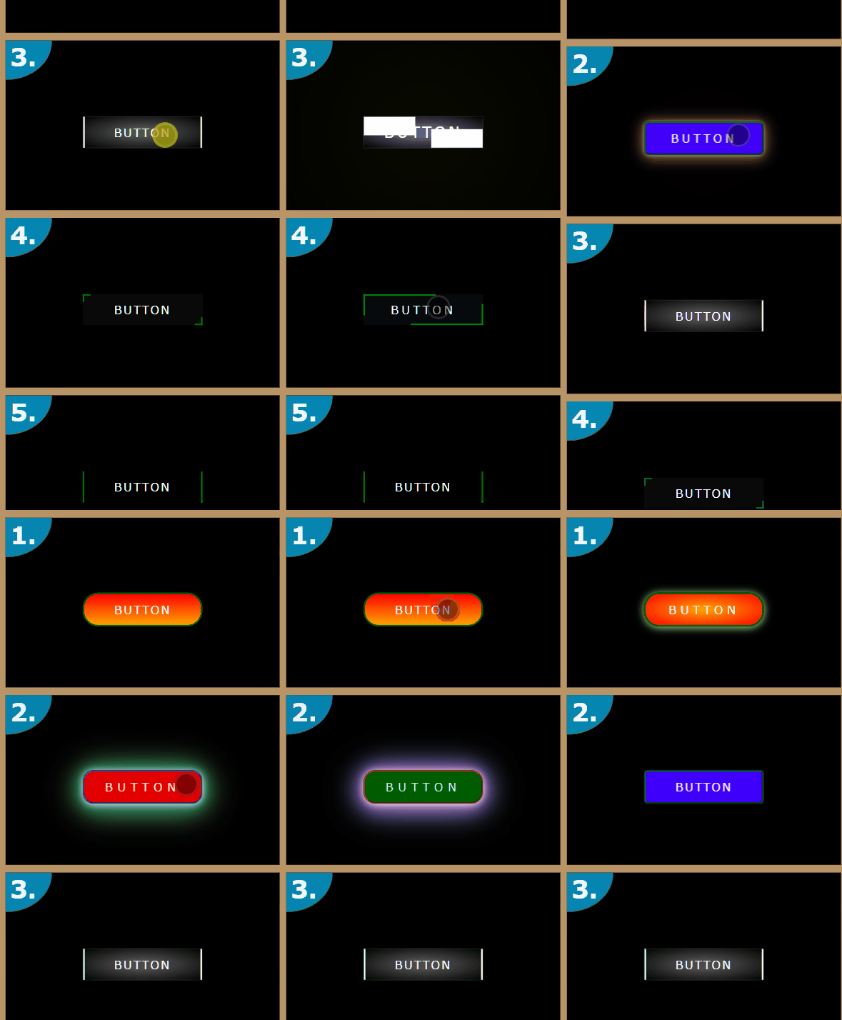
CSS 20种css3按钮hover悬停特效(来自网络)
<!DOCTYPE html>
<html lang="en">
<head>
<meta charset="UTF-8">
<meta name="viewport" content="width=device-width, initial-scale=1.0">
<title>Document</title>
<style>
* {
margin: 0;
padding: 0;
box-sizing: border-box;
font-family: Verdana, Geneva, Tahoma, sans-serif
}
div.grid {
padding: 10px;
background-color: #b89467;
display: grid;
grid-template-columns: repeat(auto-fit, minmax(220px, 1fr));
gap: 10px
}
div.grid div.field {
background-color: black;
display: flex;
position: relative;
height: 220px;
color: aliceblue;
align-items: center;
overflow: hidden;
justify-content: center
}
div.grid div.field h1 {
display: inline;
position: absolute;
padding: 2px 20px 10px 6px;
align-self: flex-start;
justify-content: flex-start;
top: 0;
border-bottom: 1px solid #7c7000;
left: 0;
background-color: #0586b1;
border-bottom-right-radius: 100%
}
div.grid div.field button {
background-color: unset;
color: white;
text-transform: uppercase;
letter-spacing: 2px;
line-height: 40px;
font-size: 15px;
width: 155px;
border: unset;
border-radius: unset;
cursor: pointer;
transform: translateY(9px)
}
div.grid div.field button:focus {
outline: 0
}
div.grid div.field .but1 {
background: linear-gradient(0deg, orange, red);
border-radius: 20px;
border: 2px darkgreen solid;
transition: .5s
}
div.grid div.field .but1:hover {
background: radial-gradient(orange, red);
box-shadow: 0 1px 10px 1px #97d189;
letter-spacing: 5px
}
div.grid div.field .but2 {
background-color: #00f;
border-radius: 5px;
filter: hue-rotate(0deg);
transition-property: filter, letter-spacing, box-shadow, border-radius;
transition-duration: 5s, 1s, 1s, 2s;
border: groove 2px green
}
div.grid div.field .but2:hover {
filter: hue-rotate(360deg);
letter-spacing: 6px;
border-radius: 16px;
box-shadow: 0 1px 10px 0 white, 0px 2px 20px 0 #4f7507, 0px 3px 30px 0 #ff0505, 0px 4px 40px 0 white, 0px 5px 300px 0 #1b0202
}
div.grid div.field .but3 {
background: radial-gradient(rgba(255, 255, 255, 0.301) 20%, black);
border-radius: none;
position: relative;
transition: .5s;
border: rgba(255, 255, 255, 0.1) 1px solid
}
div.grid div.field .but3::before,
div.grid div.field .but3::after {
content: '';
position: absolute;
height: 100%;
width: 2px;
transition: .5s;
background-color: white
}
div.grid div.field .but3::before {
top: 0;
left: 0
}
div.grid div.field .but3::after {
bottom: 0;
right: 0
}
div.grid div.field .but3:hover {
background-color: darkslateblue;
font-size: 25px;
letter-spacing: 6px;
box-shadow: 0 0 1000px 10px rgba(220, 245, 0, 0.986)
}
div.grid div.field .but3:hover:after,
div.grid div.field .but3:hover:before {
width: 100%;
height: 2px
}
div.grid div.field .but4 {
position: relative;
transition: .5s;
background-color: rgba(105, 105, 105, 0.082)
}
div.grid div.field .but4::before {
content: '';
position: absolute;
height: 10px;
width: 10px;
top: 0;
left: 0;
box-sizing: border-box;
border-top: 2.3px solid green;
border-left: 2.3px solid green;
transition: .5s;
background-color: transparent
}
div.grid div.field .but4::after {
content: '';
position: absolute;
height: 10px;
width: 10px;
box-sizing: border-box;
bottom: 0;
right: 0;
border-bottom: 2.3px solid green;
border-right: 2.3px solid green;
transition: .5s;
background-color: transparent
}
div.grid div.field .but4:hover {
letter-spacing: 5px;
background-color: rgba(0, 0, 0, 0.932);
transition: .5s
}
div.grid div.field .but4:hover:before,
div.grid div.field .but4:hover:after {
width: 100%;
height: 100%
}
div.grid div.field .but5 {
background-color: transparent;
transition: .5s
}
div.grid div.field .but5::before {
content: '';
position: absolute;
height: 100%;
width: 0;
border-radius: none;
top: 0;
left: 0;
box-sizing: border-box;
border-top: 2.3px solid green;
border-left: 2.3px solid green;
transition: .5s;
background-color: transparent
}
div.grid div.field .but5::after {
content: '';
position: absolute;
height: 100%;
width: 0;
box-sizing: border-box;
bottom: 0;
right: 0;
border-bottom: 2.3px solid green;
border-right: 2.3px solid green;
transition: .5s;
background-color: transparent
}
div.grid div.field .but5:hover {
letter-spacing: 3px;
color: yellow;
background-color: rgba(255, 255, 0, 0.0455);
transition: .5s
}
div.grid div.field .but5:hover:before,
div.grid div.field .but5:hover:after {
width: 100%;
height: 0
}
div.grid div.field .but6 {
border: 3px orangered solid;
position: relative;
background-color: #0f251a
}
div.grid div.field .but6::before {
content: '';
position: absolute;
top: -3px;
left: 15px;
background-color: #000;
width: 6px;
transition: .5s;
height: 3px
}
div.grid div.field .but6::after {
content: '';
position: absolute;
bottom: -3px;
transition: .5s;
right: 15px;
background-color: #000;
width: 6px;
height: 3px
}
div.grid div.field .but6:hover:after,
div.grid div.field .but6:hover:before {
width: 119px
}
div.grid div.field .but7 {
transform: skewX(-15deg) translateY(10px);
border-radius: 5px;
transition: .5s;
border: 2px solid Olive;
background-color: #dd0c97
}
div.grid div.field .but7:hover {
transform: translate(10px, 0) skewX(-15deg);
box-shadow: -7px 7px 1px 1px rgba(221, 12, 151, 0.623)
}
div.grid div.field .but8 {
position: relative;
transition: .5s;
overflow: hidden;
background-image: linear-gradient(to top, #423e3e 50%, rgba(255, 255, 255, 0.068) 50%);
-webkit-box-reflect: below 1px linear-gradient(rgba(0, 0, 0, 0.219), rgba(255, 255, 255, 0.005));
-moz-box-reflect: below 1px linear-gradient(rgba(0, 0, 0, 0.219), rgba(255, 255, 255, 0.005));
-o-box-reflect: below 1px linear-gradient(rgba(0, 0, 0, 0.219), rgba(255, 255, 255, 0.005))
}
div.grid div.field .but8:hover {
background-image: linear-gradient(to bottom, #423e3e 50%, rgba(255, 255, 255, 0.068) 50%);
box-shadow: 0 0 100px 5px rgba(255, 255, 255, 0.349);
color: #0fa;
letter-spacing: 4px
}
div.grid div.field .but8::after {
position: absolute;
content: '';
transition: .5s;
background: linear-gradient(45deg, transparent, rgba(241, 241, 241, 0.266), transparent);
top: 0;
left: 0;
height: 100%;
width: 100%
}
div.grid div.field .but8:hover::after {
left: 100%
}
div.grid div.field .but9 {
background-color: #0a5fbf;
position: relative;
overflow: hidden;
transition: .5s;
color: #440101;
border: greenyellow 1px solid
}
div.grid div.field .but9::after,
div.grid div.field .but9::before {
content: '';
position: absolute;
height: 100%;
width: 65%;
z-index: -1;
transition: .5s;
transform: skewX(-45deg);
background-color: greenyellow
}
div.grid div.field .but9::after {
top: 0;
right: -120px
}
div.grid div.field .but9::before {
top: 0;
left: -120px
}
div.grid div.field .but9:hover::after {
right: -20px
}
div.grid div.field .but9:hover::before {
left: -20px
}
div.grid div.field .but9:hover {
color: #141401;
letter-spacing: 5px;
border: white 1px solid
}
div.grid div.field .but10 {
transition: .5s;
color: #000;
position: relative;
border: rgba(94, 57, 3, 0.986) 1px solid;
box-shadow: #a0a0a0 -28px -63px 21px -50px inset, #fff -49px 72px 19px -50px inset, rgba(94, 78, 78, 0.89) -48px 65px 7px -50px inset, rgba(255, 255, 255, 0.89) -63px -80px 0 -50px inset, rgba(254, 254, 254, 0.47) 61px 75px 0 -49px inset
}
div.grid div.field .but10::after {
position: absolute;
content: '';
top: -1px;
color: black;
right: -1px;
transition: .5s;
width: 0;
height: 100%;
border: 1px rgba(94, 57, 3, 0.986) solid;
background-color: black
}
div.grid div.field .but10::before {
position: absolute;
content: '';
width: 100%;
height: 100%;
visibility: hidden;
transition: .5s;
background-color: rgba(255, 255, 255, 0.137);
opacity: 0;
border-radius: 50%;
top: 40px;
left: 0
}
div.grid div.field .but10:hover:after {
width: 40px;
content: '✔';
font-size: 30px;
color: green;
right: -40px
}
div.grid div.field .but10:hover:before {
opacity: 1;
visibility: visible;
transform: rotateX(75deg)
}
div.grid div.field .but10:hover {
transform: translate(-10px, 9px)
}
div.grid div.field .but11 {
position: relative
}
div.grid div.field .but11 span {
position: absolute;
top: 50%;
left: 50%;
color: #fff;
background-color: blue;
transform: translate(-50%, -50%);
letter-spacing: 2px;
line-height: inherit;
width: inherit;
font-size: inherit;
width: inherit
}
div.grid div.field .but11 span:nth-child(1) {
clip-path: polygon(50% 0, 85% 0, 100% 50%, 85% 100%, 50% 100%);
background-color: #00e71f
}
div.grid div.field .but11 span:nth-child(2) {
clip-path: polygon(15% 0, 50% 0, 50% 100%, 15% 100%, 0% 50%);
background-color: #523c01
}
div.grid div.field .but11 span:nth-child(1):hover {
z-index: 1;
color: #523c01;
clip-path: polygon(15% 0, 85% 0, 100% 50%, 85% 100%, 15% 100%, 0 50%)
}
div.grid div.field .but11 span:nth-child(2):hover {
z-index: 1;
color: #00e71f;
clip-path: polygon(15% 0, 85% 0, 100% 50%, 85% 100%, 15% 100%, 0 50%)
}
div.grid div.field .but12 {
background-color: rgba(128, 128, 0, 0.103);
transition: .5s
}
div.grid div.field .but12 svg,
div.grid div.field .but12 svg rect {
position: absolute;
top: 0;
left: 0;
transition: 1s;
width: 100%;
height: 100%;
fill: transparent
}
div.grid div.field .but12 svg rect {
stroke: #f00;
stroke-width: 5px;
stroke-dasharray: 155 40;
stroke-dashoffset: 195
}
div.grid div.field .but12:hover svg rect {
stroke: lightseagreen;
stroke-dasharray: 40 155;
stroke-dashoffset: -155
}
div.grid div.field .but13 {
background-color: transparent;
color: #ffff;
display: flex;
transition: .5s;
align-items: center;
justify-content: center;
height: 100px
}
div.grid div.field .but13 svg {
position: absolute;
transition: 1s;
top: 0;
left: 0;
width: 100%;
height: 100px
}
div.grid div.field .but13 svg ellipse {
position: absolute;
fill: transparent;
transition: .5s cubic-bezier(0.24, 0.32, 0.51, 1.43);
stroke-width: 3px;
stroke: #00cbe6;
fill: rgba(64, 224, 208, 0.096);
stroke-dasharray: 77 50;
stroke-dashoffset: 127
}
div.grid div.field .but13:hover svg ellipse {
stroke-dasharray: 550 127;
stroke-dashoffset: 127
}
div.grid div.field .but13:hover {
color: #00ff0d;
letter-spacing: 5px
}
div.grid div.field .but14 {
background-color: yellowgreen;
position: relative;
color: #2a2b03;
transition: .5s
}
div.grid div.field .but14 span {
position: absolute;
width: 0;
height: 0;
transition: .5s;
background-color: transparent;
border: 2px #000 solid
}
div.grid div.field .but14 span:nth-child(1) {
top: 0;
left: 0
}
div.grid div.field .but14 span:nth-child(2) {
top: 0;
right: 0
}
div.grid div.field .but14 span:nth-child(3) {
bottom: 0;
left: 0
}
div.grid div.field .but14 span:nth-child(4) {
bottom: 0;
right: 0
}
div.grid div.field .but14:hover span {
height: 85%;
width: 96%;
border: 2px #000 ridge
}
div.grid div.field .but14:hover {
letter-spacing: 6px;
color: black
}
div.grid div.field .but15 {
background-color: transparent;
position: relative;
overflow: hidden;
transition: .5s
}
div.grid div.field .but15 span:nth-child(1) {
position: absolute;
width: 100%;
height: 2px;
top: 0;
left: -100%;
background-color: gold;
animation: sp1 3s linear alternate-reverse infinite
}
@keyframes sp1 {
from {
left: -100%
}
to {
left: 100%
}
}
div.grid div.field .but15 span:nth-child(2) {
position: absolute;
width: 100%;
height: 2px;
bottom: 0;
right: -100%;
background-color: gold;
animation: sp2 3s linear alternate-reverse infinite
}
@keyframes sp2 {
from {
right: -100%
}
to {
right: 100%
}
}
div.grid div.field .but15 span:nth-child(3) {
position: absolute;
height: 100%;
width: 2px;
top: -40px;
left: 0;
background: gold;
animation: sp3 3s linear alternate-reverse infinite
}
@keyframes sp3 {
from {
top: -100%
}
to {
top: 100%
}
}
div.grid div.field .but15 span:nth-child(4) {
position: absolute;
height: 100%;
width: 2px;
bottom: -40px;
right: 0;
background-color: gold;
animation: sp4 3s linear alternate-reverse infinite
}
@keyframes sp4 {
from {
bottom: -100%
}
to {
bottom: 100%
}
}
div.grid div.field .but15:hover {
letter-spacing: 5px;
background-color: gold;
color: black;
box-shadow: 0 0 100px 3px gold
}
div.grid div.field .but16 {
background-color: aqua;
position: relative;
color: darkbLue;
transition: 1s;
transform: rotateY(0deg)
}
div.grid div.field .but16:before,
div.grid div.field .but16:after {
position: absolute;
content: '';
height: 100%;
width: 20%;
border-radius: 50%;
background-color: #000
}
div.grid div.field .but16:before {
top: 0;
left: -10%
}
div.grid div.field .but16:after {
top: 0;
right: -10%
}
div.grid div.field .but16:focus {
transform: rotateX(180deg);
background-color: #030338;
transition: 1s
}
div.grid div.field .but16 span {
position: relative;
display: inline-block;
transition: .5s;
transform: rotate(0deg)
}
div.grid div.field .but16:focus span {
transform: rotate(180deg) rotateY(180deg);
transition: .5s;
color: #fff;
letter-spacing: 5px
}
div.grid div.field .but17 {
background-color: red;
position: relative;
transition: .5s;
transform: rotate(0deg)
}
div.grid div.field .but17 span:nth-child(1) {
position: absolute;
transform: skewX(-45deg);
width: 100%;
height: 10px;
background-color: rgba(255, 0, 0, 0.637);
top: -10px;
z-index: 6;
left: 5px
}
div.grid div.field .but17 span:nth-child(2) {
position: absolute;
transform: skewY(-45deg);
width: 10px;
height: 100%;
background-color: #3a0303;
top: -5px;
z-index: 6;
right: -10px
}
div.grid div.field .but17::before {
content: '';
position: absolute;
height: 100%;
width: 100%;
top: 0;
left: 0;
background: linear-gradient(to left, transparent, rgba(255, 255, 255, 0.5), transparent)
}
div.grid div.field .but17:hover {
transition: .5s;
letter-spacing: 4px;
background-color: maroon;
transform: rotate(360deg)
}
div.grid div.field .but18 {
position: relative;
transition: .5s;
background-color: mediumblue
}
div.grid div.field .but18 span {
position: absolute;
background-image: linear-gradient(-45deg, transparent 33.33%, #009688 33.33%, #009688 66.667%, transparent 66.66%), linear-gradient(45deg, transparent 33.33%, #009688 33.33%, #009688 66.667%, transparent 66.66%);
background-size: 20px 40px
}
div.grid div.field .but18 span:nth-child(1) {
width: 100%;
height: 10px;
top: -10px;
left: 0
}
div.grid div.field .but18 span:nth-child(2) {
width: 100%;
height: 10px;
bottom: -10px;
transform: rotate(180deg);
left: 0
}
div.grid div.field .but18 span:nth-child(3) {
width: 40px;
height: 10px;
top: 15px;
transform: rotate(90deg);
right: -25px
}
div.grid div.field .but18 span:nth-child(4) {
width: 40px;
height: 10px;
transform: rotate(-90deg);
top: 15px;
left: -25px
}
div.grid div.field .but18:hover {
box-shadow: 0 0 2px 20px #009688 inset;
color: #000;
letter-spacing: 5px
}
div.grid div.field .but19 {
position: relative;
font-size: 20px;
color: white
}
div.grid div.field .but19 span {
position: absolute;
width: 100%;
height: 50%;
left: 0;
z-index: -1;
background-size: 10px 5px
}
div.grid div.field .but19 span:nth-child(1) {
top: 0;
background-image: linear-gradient(to right, #2b2a289c 50%, #65616891 50%)
}
div.grid div.field .but19 span:nth-child(2) {
top: 50%;
background-image: linear-gradient(to right, #65616891 50%, #2b2a289c 50%)
}
div.grid div.field .but19::after {
position: absolute;
content: '';
bottom: 15%;
left: 50%;
width: 0;
transition: .5s;
height: 2px;
background-color: white
}
div.grid div.field .but19:hover:after {
width: 60%;
transform: translateX(-50%)
}
div.grid div.field .but20 {
background-color: orange;
position: relative;
border-radius: 20px;
transition: .5s;
box-shadow: 0 1px 10px 1px #522f03 inset
}
div.grid div.field .but20::before {
content: '';
position: absolute;
top: 50%;
left: 50%;
z-index: -1;
width: 80%;
height: 80%;
transition: .5s;
transform: translate(-50%, -50%);
border-radius: 16px;
border-top: 2px rgba(255, 255, 255, 0.945) solid;
border-bottom: 2px rgba(0, 0, 0, 0.9) solid;
background-color: transparent
}
div.grid div.field .but20::after {
position: absolute;
content: '';
bottom: -2px;
left: -2px;
width: 0;
height: 0;
transition: .5s;
border: 2px solid orangered;
border-radius: 21px;
opacity: 0;
background-color: transparent
}
div.grid div.field .but20:hover::before {
width: 95%
}
div.grid div.field .but20:hover::after {
opacity: 1;
width: 100%;
height: 100%
}
div.grid div.field .but20:hover {
background-color: rgba(177, 37, 13, 0.788);
letter-spacing: 5px
}
</style>
</head>
<body>
<div class="grid">
<div class="field">
<h1>1.</h1><button class="but1">button</button>
</div>
<div class="field">
<h1>2.</h1><button class="but2">button</button>
</div>
<div class="field">
<h1>3.</h1><button class="but3">button</button>
</div>
<div class="field">
<h1>4.</h1><button class="but4">button</button>
</div>
<div class="field">
<h1>5.</h1><button class="but5">button</button>
</div>
<div class="field">
<h1>6.</h1><button class="but6">button</button>
</div>
<div class="field">
<h1>7.</h1><button class="but7">button</button>
</div>
<div class="field">
<h1>8.</h1><button class="but8">button</button>
</div>
<div class="field">
<h1>9.</h1><button class="but9">button</button>
</div>
<div class="field">
<h1>10.</h1><button class="but10">button</button>
</div>
<div class="field">
<h1>11.</h1><button class="but11"><span>BUTTON</span><span>BUTTON</span></button>
</div>
<div class="field">
<h1>12.</h1><button class="but12"><svg>
<rect></rect>
</svg>button </button>
</div>
<div class="field">
<h1>13.</h1><button class="but13"><svg>
<ellipse cx="77" cy="50" rx="73" ry="48"></ellipse>
</svg>button </button>
</div>
<div class="field">
<h1>14.</h1><button class="but14"><span></span><span></span><span></span><span></span>button </button>
</div>
<div class="field">
<h1>15.</h1><button class="but15"><span></span><span></span><span></span><span></span>button </button>
</div>
<div class="field">
<h1>16.</h1><button class="but16"><span>button</span></button>
</div>
<div class="field">
<h1>17.</h1><button class="but17"><span></span><span></span>button </button>
</div>
<div class="field">
<h1>18.</h1><button class="but18"><span></span><span></span><span></span><span></span>button </button>
</div>
<div class="field">
<h1>19.</h1><button class="but19"><span></span><span></span>button </button>
</div>
<div class="field">
<h1>20.</h1><button class="but20">button</button>
</div>
</div>
</body>
</html>