CSS 打字效果和JS监听动画元素即将进入视口后再加载
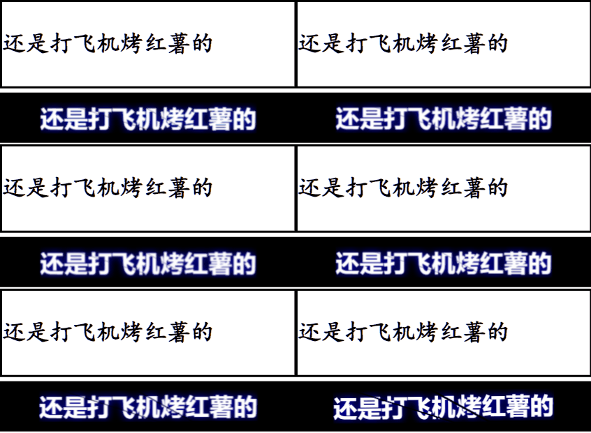
主要是JS监听动画元素即将进入视口后再加载
<!DOCTYPE html>
<html lang="zh-Hans">
<head>
    <meta charset="UTF-8">
    <meta name="viewport" content="width=device-width, initial-scale=1.0">
    <meta name="format-detection" content="telephone=no">

    <style>
        .ooo {
            font-size: 30px;
            width: 14em;
            height: 1.25em;
            white-space: nowrap;
            border-right: 3px solid transparent;
            font-family: 楷体, Consolas, Monaco;
            font-weight: 800;
            word-break: break-all;
            overflow: hidden;
        }

        .typing {
            font-size: 30px;
            width: 14em;
            height: 1.25em;
            white-space: nowrap;
            border-right: 3px solid transparent;
            animation: typing 3s forwards steps(26, end), blink-caret .75s forwards step-end;
            animation-direction: alternate;
            font-family: 楷体, Consolas, Monaco;
            font-weight: 800;
            word-break: break-all;
            overflow: hidden;

        }

        .ooo {
            font-size: 30px;
            width: 14em;
            height: 1.25em;
            white-space: nowrap;
            border-right: 3px solid transparent;
            font-family: 楷体, Consolas, Monaco;
            font-weight: 800;
            word-break: break-all;
            overflow: hidden;
        }

        /* 打印效果 */
        @keyframes typing {
            from {
                width: 0;
            }

            to {
                width: 14em;
            }
        }

        /* 光标闪啊闪 */
        @keyframes blink-caret {

            from,
            to {
                border-color: transparent;
            }

            50% {
                border-color: currentColor;
            }
        }

        .dazi {
            background-color: #fff;
            border: 3px solid #000;
            padding: 5px 0;
            margin: 5px 0;
        }

        .kuyun {
            display: flex;
            height: 4em;
            width: 100%;
            background-color: #000;
            overflow: hidden;
            font-family: sans-serif;
        }

        .kuyun h1 {
            position: relative;
            margin: auto;
            font-size: 30px;
            font-weight: bold;
            color: #fff;
            letter-spacing: 0.02em;
            text-transform: uppercase;
            text-shadow: 0 0 10px blue;
            user-select: none;
            white-space: nowrap;
            filter: blur(0.007em);
            animation: shake 2.5s .2s linear forwards;
        }

        .kuyun h1 span {
            position: absolute;
            top: 0;
            left: 0;
            transform: translate(-50%, -50%);
            clip-path: polygon(10% 0%, 44% 0%, 70% 100%, 55% 100%);
        }

        .kuyun h1::before,
        .kuyun h1::after {
            content: attr(data-text);
            position: absolute;
            top: 0;
            left: 0;
        }

        .kuyun h1::before {
            animation: crack1 2.5s linear forwards;
            clip-path: polygon(0% 0%, 10% 0%, 55% 100%, 0% 100%);
        }

        .kuyun h1::after {
            animation: crack2 2.5s linear forwards;
            clip-path: polygon(44% 0%, 100% 0%, 100% 100%, 70% 100%);
        }

        @keyframes shake {

            5%,
            15%,
            25%,
            35%,
            55%,
            65%,
            75%,
            95% {
                filter: blur(0.018em);
                transform: translateY(0.018em) rotate(0deg);
            }

            10%,
            30%,
            40%,
            50%,
            70%,
            80%,
            90% {
                filter: blur(0.01em);
                transform: translateY(-0.018em) rotate(0deg);
            }

            20%,
            60% {
                filter: blur(0.03em);
                transform: translate(-0.018em, 0.018em) rotate(0deg);
            }

            45%,
            85% {
                filter: blur(0.03em);
                transform: translate(0.018em, -0.018em) rotate(0deg);
            }

            100% {
                filter: blur(0.007em);
                transform: translate(0) rotate(-0.5deg);
            }
        }

        @keyframes crack1 {

            0%,
            95% {
                transform: translate(-50%, -50%);
            }

            100% {
                transform: translate(-51%, -48%);
            }
        }

        @keyframes crack2 {

            0%,
            95% {
                transform: translate(-50%, -50%);
            }

            100% {
                transform: translate(-49%, -53%);
            }
        }
    </style>

</head>

<body>


    <div class="dazi">
        <p class="typing ooo">还是打飞机烤红薯的</p>
    </div>


    <!-- 使用HTML5的新属性:数据属性:data-, -->
    <div id="1x1m" data-animation="kuyun" class="waiting-for-add">
        <h1 data-text="还是打飞机烤红薯的"><span>还是打飞机烤红薯的</span></h1>
    </div>

    <script>
    	// 处理typing动画暂停5s
        var scrollTip = document.querySelector('.typing');
        scrollTip.classList.add('typing');
        scrollTip.addEventListener('animationend', function () {
            scrollTip.classList.remove('typing');
            setTimeout(function () {
                scrollTip.classList.add('typing');
            }, 5000)
        })
    </script>


    <script>
    	// 开始进入视口的动画
        // 当元素进入视图时触发的回调函数
        const handleIntersection = (entries, observer) => {
            entries.forEach(entry => {
                if (entry.isIntersecting) {
                    const animationClassName = entry.target.getAttribute('data-animation');
                    entry.target.classList.add(animationClassName); // 添加对应的动画
                    observer.unobserve(entry.target); // 元素一旦进入视图并开始动画,停止观察它
                }
            });
        };

        // 配置Intersection Observer
        const options = {
            root: null,         // 使用视口作为根
            rootMargin: '0px',  // 无边距
            threshold: 0.1      // 当元素至少有10%可见时触发
        };

        const observer = new IntersectionObserver(handleIntersection, options);

        // 观察所有希望在进入视图时开始动画的元素
        const elements = document.querySelectorAll('.waiting-for-add');
        elements.forEach(el => {
            observer.observe(el);
        });
    </script>

</body>
</html>