码海无涯系列,写给自己的注释
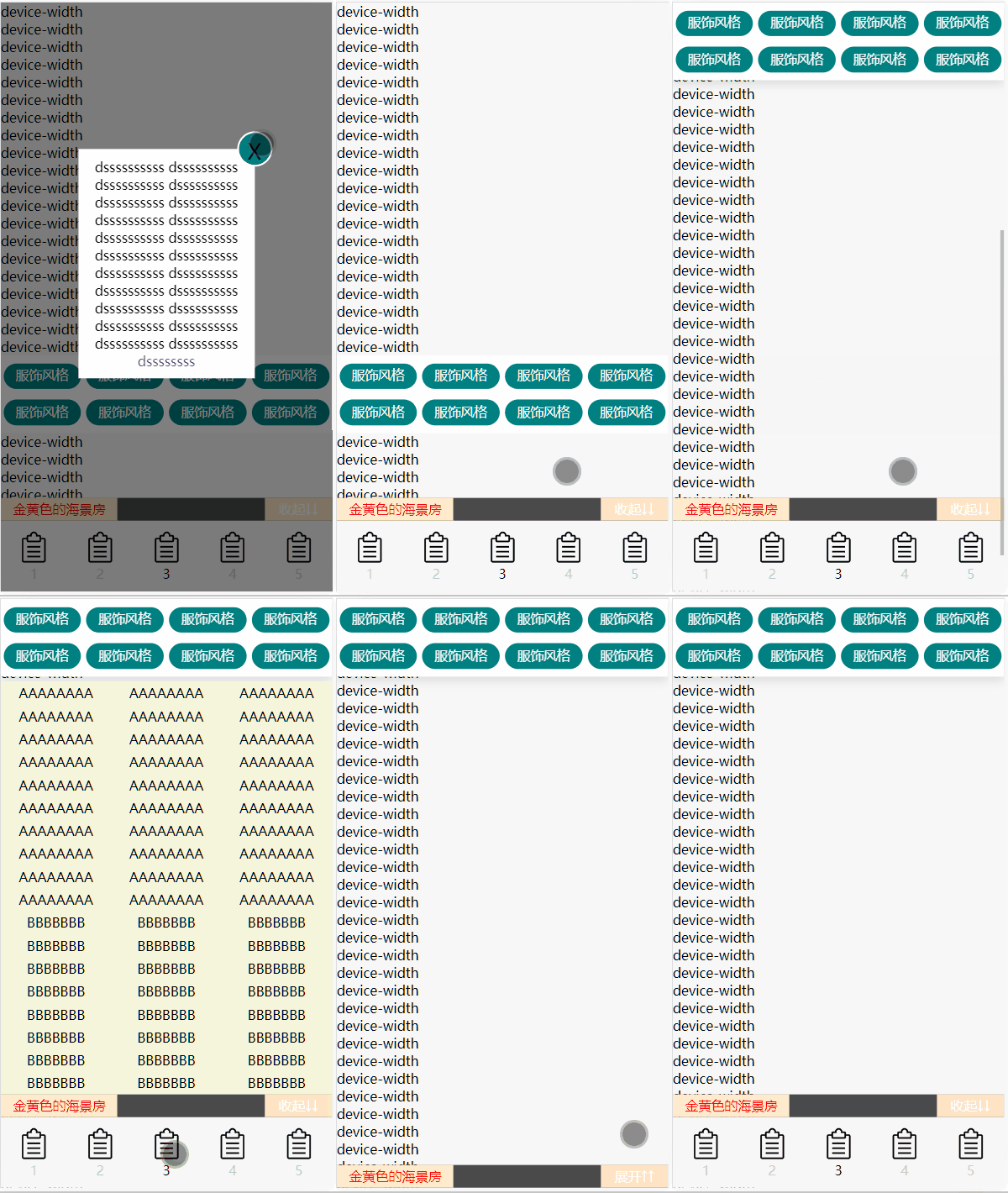
关于scrollTop,参考另外一篇文章
<!DOCTYPE html>
<html lang="zh-CN">
<head>
<meta charset="UTF-8">
<meta name="viewport" content="width=device-width, initial-scale=1.0">
<title>Document</title>
<style>
* {
padding: 0;
margin: 0;
box-sizing: border-box;
}
a {
text-decoration: none;
}
ul,
li {
list-style: none;
}
.container {
position: relative;
height: 100%;
width: 100%;
max-width: 800px;
margin: 0 auto;
background-color: #f7f7f7;
}
.footer {
position: fixed;
bottom: 0;
width: 100%;
max-width: 800px;
height: 106px;
z-index: 2;
}
.footer ul {
display: flex;
align-items: center;
justify-content: center;
background-color: #f7f7f7;
}
.footer ul li {
flex: 1;
height: 80px;
display: flex;
flex-direction: column;
align-content: center;
justify-content: center;
align-items: center;
}
.footer ul li span {
display: block;
width: 40px;
height: 40px;
background: url('list.png');
background-repeat: no-repeat;
background-size: 100% 100%;
background-origin: content-box;
}
.footer ul li a {
text-align: center;
color: #ccc;
}
.heihei {
width: 100%;
height: 26px;
line-height: 26px;
background-color: rgb(0, 0, 0, .7);
text-align: center;
position: relative;
}
.heihei a {
position: absolute;
left: 0;
display: inline-block;
width: 132px;
color: red;
background-color: blanchedalmond;
}
#switch1 {
position: absolute;
right: 0;
width: 76px;
color: #fff;
background-color: bisque;
}
#hidecontent {
position: fixed;
bottom: 106px;
width: 100%;
max-width: 800px;
margin: 0 auto;
background-color: beige;
z-index: 1;
}
#hidecontent ul {
display: flex;
flex-wrap: wrap;
}
#hidecontent ul li {
flex: 1;
width: calc(100% / 3);
min-width: calc(100% / 3);
max-width: calc(100% / 3);
text-align: center;
padding: 3px 0;
}
#navigation {
display: flex;
flex-direction: column;
align-items: center;
width: 100%;
max-width: 800px;
height: 88px;
background-color: #fff;
top: 0;
}
#navigation ul {
width: 100%;
display: flex;
height: 35px;
margin: 6px;
}
#navigation ul:nth-child(2) {
margin-top: 0;
}
#navigation ul li {
flex: 1;
width: calc(100%-12px / 3);
/* 当上面设置的子项目的宽不期作用,可以加上下面2行试试 */
min-width: calc(100%-12px / 3);
max-width: calc(100%-12px / 3);
text-align: center;
padding: 3px 0;
margin: 3px;
background-color: #008080;
border-radius: 20px;
}
#navigation[data-fixed="fixed"] {
position: fixed;
top: 0;
left: 0;
right: 0;
margin: auto;
z-index: 1;
box-shadow: 0 5px 10px rgba(0, 0, 0, .1);
}
.modal {
/**
* 这里是关于遮罩的写法
* 首先
* 1. 该遮罩的HTML应该写在最大的容器中
* 2. z-index的值比其他的高
* 3. position: fixed,不要absolute,防止跟着容器滚动
* 4. 宽高100%
**/
display: flex;
justify-content: center;
align-items: center;
position: fixed;
top: 0;
left: 0;
bottom: 0;
right: 0;
width: 100%;
height: 100%;
background-color: rgba(0, 0, 0, .5);
z-index: 3;
}
.modalcontent {
position: relative;
width: 200px;
height: auto;
padding: 10px;
margin-top: -75px;
background-color: #fff;
text-align: center;
}
.closed {
position: absolute;
top: -20px;
right: -20px;
width: 40px;
height: 40px;
border-radius: 50%;
background-color: #008080;
border: 2px solid #fff;
text-align: center;
line-height: 40px;
font-size: 25px;
cursor: pointer;
}
</style>
</head>
<body>
<div class="container">
<div class="modal">
<div class="modalcontent">
<!-- 此处的关闭符号x,X应该使用大写,否则看起来就不水平居中,即使用了line-height -->
<div class="closed">X</div>
dssssssssss
dssssssssss
dssssssssss
dssssssssss
dssssssssss
dssssssssss
dssssssssss
dssssssssss
dssssssssss
dssssssssss
dssssssssss
dssssssssss
dssssssssss
dssssssssss
dssssssssss
dssssssssss
dssssssssss
dssssssssss
dssssssssss
dssssssssss
dssssssssss
dssssssssss
<a href="http://1.com/" target="_blank">dssssssss</a>
</div>
</div>
<div class="content">
device-width<br>
device-width<br>
device-width<br>
device-width<br>
device-width<br>
device-width<br>
device-width<br>
device-width<br>
device-width<br>
device-width<br>
device-width<br>
device-width<br>
device-width<br>
device-width<br>
device-width<br>
device-width<br>
device-width<br>
device-width<br>
device-width<br>
device-width<br>
<div id="navigation" style="color: #f7f7f7;" data-fixed="">
<ul>
<li>服饰风格</li>
<li>服饰风格</li>
<li>服饰风格</li>
<li>服饰风格</li>
</ul>
<ul>
<li>服饰风格</li>
<li>服饰风格</li>
<li>服饰风格</li>
<li>服饰风格</li>
</ul>
</div>
device-width<br>
device-width<br>
device-width<br>
device-width<br>
device-width<br>
device-width<br>
device-width<br>
device-width<br>
device-width<br>
device-width<br>
device-width<br>
device-width<br>
device-width<br>
device-width<br>
device-width<br>
device-width<br>
device-width<br>
device-width<br>
device-width<br>
device-width<br>
device-width<br>
device-width<br>
device-width<br>
device-width<br>
device-width<br>
device-width<br>
device-width<br>
device-width<br>
device-width<br>
device-width<br>
device-width<br>
device-width<br>
device-width<br>
device-width<br>
device-width<br>
device-width<br>
device-width<br>
device-width<br>
device-width<br>
device-width<br>
</div>
<div class="footer">
<div class="heihei">
<a href="http://1.com/">金黄色的海景房</a>
<span id="switch1">收起↓↓</span>
</div>
<ul id="footerul" style="display: flex;">
<li><a href="http://1.com/"><span></span>1</a></li>
<li><a href="http://1.com/"><span></span>2</a></li>
<li id="more" style="display: flex;"><span></span>3</li>
<li><a href="http://1.com/"><span></span>4</a></li>
<li><a href="http://1.com/"><span></span>5</a></li>
</ul>
</div>
<div id="hidecontent" style="display: none;">
<ul class="white">
<li>AAAAAAAA</li>
<li>AAAAAAAA</li>
<li>AAAAAAAA</li>
<li>AAAAAAAA</li>
<li>AAAAAAAA</li>
<li>AAAAAAAA</li>
<li>AAAAAAAA</li>
<li>AAAAAAAA</li>
<li>AAAAAAAA</li>
<li>AAAAAAAA</li>
<li>AAAAAAAA</li>
<li>AAAAAAAA</li>
<li>AAAAAAAA</li>
<li>AAAAAAAA</li>
<li>AAAAAAAA</li>
<li>AAAAAAAA</li>
<li>AAAAAAAA</li>
<li>AAAAAAAA</li>
<li>AAAAAAAA</li>
<li>AAAAAAAA</li>
<li>AAAAAAAA</li>
<li>AAAAAAAA</li>
<li>AAAAAAAA</li>
<li>AAAAAAAA</li>
<li>AAAAAAAA</li>
<li>AAAAAAAA</li>
<li>AAAAAAAA</li>
<li>AAAAAAAA</li>
<li>AAAAAAAA</li>
<li>AAAAAAAA</li>
</ul>
<ul class="black">
<li>BBBBBBB</li>
<li>BBBBBBB</li>
<li>BBBBBBB</li>
<li>BBBBBBB</li>
<li>BBBBBBB</li>
<li>BBBBBBB</li>
<li>BBBBBBB</li>
<li>BBBBBBB</li>
<li>BBBBBBB</li>
<li>BBBBBBB</li>
<li>BBBBBBB</li>
<li>BBBBBBB</li>
<li>BBBBBBB</li>
<li>BBBBBBB</li>
<li>BBBBBBB</li>
<li>BBBBBBB</li>
<li>BBBBBBB</li>
<li>BBBBBBB</li>
<li>BBBBBBB</li>
<li>BBBBBBB</li>
<li>BBBBBBB</li>
<li>BBBBBBB</li>
<li>BBBBBBB</li>
<li>BBBBBBB</li>
</ul>
</div>
</div>
<script>
let hidecontent = document.getElementById('hidecontent');
let more = document.getElementById('more');
let switch1 = document.getElementById('switch1');
let footerul = document.getElementById('footerul');
// document.getElementsByClassName 获得的是一个 HTMLCollection 对象,
// 包含所有具有指定类名的元素。即使只有一个元素具有该类名,也会返回一个集合。
// 所以在后面加上一个[0],表示拿第一个匹配项
let footer = document.getElementsByClassName('footer')[0];
let navigation = document.getElementById('navigation');
// document.querySelector和getElementsByClassName不同的是,
// 它返回第一个匹配项,即使有很多使用同样类名的元素
let closed = document.querySelector('.closed');
let modal = document.querySelector('.modal');
let modalcontent = document.querySelector('.modalcontent');
closed.addEventListener('click', function () {
modal.style.display = "none";
modalcontent.style.display = "none";
})
modal.addEventListener('click', function () {
modal.style.display = "none";
modalcontent.style.display = "none";
});
switch1.addEventListener('click', function () {
// 这里使用了3元运算符,注意写法
// 比如下面的一句,首先display:flex和display:block是冲突的
// 所以只能写成display:flex和display:none
// 3元运算符是一个条件后跟一个问号(?),如果条件为真值,则执行冒号(:)前的表达式;若条件为假值,则执行最后的表达式。
// 最后是使用JS访问元素的样式的写法,如:footer.style.marginBottom
// 元素.style.属性=== '属性值';
// JS访问修改元素的CSS有4种方法(?),现在这种是修改内联样式的,属性的写法使用驼峰法
// 在jQuery中,使用.css来获取和修改DOM的样式
/**
* 1. HTMLElement.style 属性返回一个 CSSStyleDeclaration 对象,
* 表示元素的 内联style 属性(attribute),但无法读取内嵌和外部的样式表属性。
* 2. Element.currentStyle 仅限IE浏览器,和getComputedStyle()差不多
* 3. window.getComputedStyle()获取所有的 css 样式,
* 获取计算后的样式(computed styles)对象,
* 该对象包含应用于元素的所有样式属性的最终计算值。
*
* 4. Element.getBoundingClientRect();
* 最偏门的一种用法.用于获取某个元素相对于视窗的位置集合。
* 返回的对象中有 top, right, bottom, left,width,height 等属性。
* 除了 width 和 height 外的属性都是相对于视口的左上角位置而言的。
* **/
footerul.style.display = (footerul.style.display === "flex") ? "none" : "flex";
more.style.display = (more.style.display === "flex") ? "none" : "flex";
switch1.innerText = (switch1.innerText === '收起↓↓') ? "展开↑↑" : "收起↓↓";
footer.style.marginBottom = (footer.style.marginBottom === "") ? "-80px" : "";
})
more.addEventListener("click", function () {
hidecontent.style.display = (hidecontent.style.display === "none") ? "block" : "none";
});
/**
* 1.
* 下面这个函数抄的,offsetTop大概指元素顶部到父元素的顶部的距离
* 当使用offsetTop的元素的父元素没有使用absolute或者fixed定位时,则子元素的offsetTop为到其顶部到最近的父元素的顶部的距离。所以一般地,这个用法用来测量元素到root顶部的距离(想测这个的,子元素的父元素不要给定位)
*
* offsetTop 属性返回的是一个元素的上边缘(border edge)与其 offsetParent 元素的上边缘之间的距离。offsetParent 是最近的已经定位(positioned)的祖先元素,如果没有已经定位的祖先元素,则 offsetParent 是根元素(root element)。如果子元素的父元素没有使用 absolute 或 fixed 定位,则 offsetTop 表示子元素的上边缘到最近的已经定位的祖先元素的上边缘的距离。如果没有已经定位的祖先元素,则它表示到根元素的距离。所以,你可以使用 offsetTop 来测量一个元素到根元素(或最近的已经定位的祖先元素)顶部的距离,但在子元素的父元素没有定位时,offsetTop 表示到根元素的距离。
*
* 2.
* 关于st变量,参看文章:
* 关于document.body.scrollTop和document.documentElement.scrollTop 值为0的问题
* 链接:
* 2024/01/25/guan-yu-document-body-scrolltop-he-document-documentelement-scrolltop-zhi-wei-0-de-wen-ti/
*
* 3.
* obj.setAttribute("data-fixed", st >= ot ? "fixed" : "")
* 使用这样设置吸顶的方法,明显比使用时刻检测该元素到root顶部的距离节约性能
* 而且页面还不抖动
* st是root的滚动条到顶部的距离
* ot是导航到顶部的距离(相对于root)
* 当ot小于st,ot=>fixed
* 这里ot在初始化时是200px, 当st离顶部大于200px时,
* 也就是页面向下滚动200px,此时导航来到顶部,所以此时给导航一个CSS声明#navigation[data-fixed="fixed"](前面在CSS表里已经写好)
* **/
var obj = document.getElementById("navigation");
var ot = obj.offsetTop;
console.log("🚀 ~ ot:", ot)
document.onscroll = function () {
var st = document.body.scrollTop || document.documentElement.scrollTop;
console.log("🚀 ~ st:", st)
// 关于scrollTop,参考另外一篇[文章](/2024/01/25/guan-yu-document-body-scrolltop-he-document-documentelement-scrolltop-zhi-wei-0-de-wen-ti/)
// setAttribute语法: element.setAttribute(attribute name,attribute value)
// 观察setAttribute在浏览器的操作过程,发现其每次都使用"=",所以这个方法是给标签赋予内联样式,或者类名的,
// 赋予类名时,直接在attribute name写‘class’,然后在后面写class name
// 内联样式则在attribute name写‘style’,后面像写内联CSS一样直接写一堆属性和值
// 内联样式也可以这样写element.setAttribute("align","200px")
// 在这里利用了:括号内的属性名和值都是必须的
// 所以当后面的3元运算符的条件不成立时,设置为空,导致该CSS无效
// 当3元运算符的条件成立时,设置为fixed,该CSS有效
// 正常人会用if来写:if(st >= ot){obj.setAttribute("data-fixed","fixed")} else{obj.removeAttribute("data-fixed")}
// 关于removeAttribute,其值只有一个,可以填class,style,也可以填padding,align之类,
// 它和setAttribute一样,每次都是操作=号,
//obj.setAttribute("data-fixed", st >= ot ? "fixed" : "");
if (st >= ot) {
obj.setAttribute("data-fixed", "fixed")
} else {
obj.removeAttribute("data-fixed")
}
}
</script>
</body>
</html>