CSS八种让人眼前一亮的HOVER效果
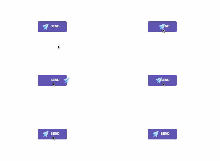
一.发送效果
HTML
<div id="send-btn">
  <button>
       <svg width="25px" height="25px" viewBox="0 0 402 403" version="1.1" xmlns="http://www.w3.org/2000/svg" xmlns:xlink="http://www.w3.org/1999/xlink">
    <g id="Page-1" stroke="none" stroke-width="1" fill="none" fill-rule="evenodd">
        <g id="email" transform="translate(-65.000000, -45.000000)" fill-rule="nonzero">
            <path d="M462.409,75.155 L242.847,390.775 L139.609,372.39 L457.101,53.485 L460.81,57.194 C465.62,62.005 466.294,69.57 462.409,75.155 Z" id="Path" fill="#55A4F9"></path>
            <path d="M139.61,372.39 L121.225,269.152 L436.767,49.645 C442.397,45.729 450.023,46.408 454.873,51.257 L458.515,54.899 L139.61,372.39 Z M242.847,390.775 L263.045,370.577 L213.856,333.5 L242.847,390.775 Z" id="Shape" fill="#1380E2"></path>
            <polygon id="Path" fill="#4172CC" points="184.157 303.801 121.225 269.153 139.61 250.768"></polygon>
            <path d="M454.998,51.383 L184.176,303.82 L68.873,188.517 C63.654,183.298 65.694,174.417 72.667,171.998 L434.216,46.609 C441.486,44.088 449.557,45.942 454.998,51.383 Z M460.617,57.002 L213.837,333.48 L323.483,443.126 C328.702,448.345 337.583,446.305 340.002,439.332 L465.391,77.784 C467.912,70.514 466.058,62.443 460.617,57.002 Z" id="Shape" fill="#A7D0FC"></path>
            <path d="M465.391,77.785 L394.817,281.279 C382.208,317.636 335.906,328.271 308.696,301.061 C289.148,281.513 288.257,250.104 306.666,229.48 L460.617,57.002 C466.058,62.443 467.912,70.514 465.391,77.785 L465.391,77.785 Z M434.215,46.609 L230.721,117.183 C194.364,129.792 183.729,176.093 210.939,203.304 L214.46,206.825 C234.316,226.681 266.331,227.243 286.872,208.096 L454.998,51.383 C449.557,45.942 441.486,44.088 434.215,46.609 L434.215,46.609 Z" id="Shape" fill="#C8E2FD"></path>
            <path d="M199.979,352.149 L130.682,421.445 C129.706,422.422 128.426,422.91 127.147,422.91 C125.868,422.91 124.587,422.422 123.612,421.445 C121.659,419.493 121.659,416.327 123.612,414.375 L192.909,345.079 C194.86,343.126 198.028,343.126 199.979,345.079 C201.932,347.031 201.932,350.197 199.979,352.149 Z M206.519,375.661 C204.568,373.708 201.4,373.708 199.449,375.661 L164.095,411.016 C162.142,412.968 162.142,416.134 164.095,418.086 C165.071,419.063 166.351,419.551 167.63,419.551 C168.909,419.551 170.19,419.063 171.165,418.086 L206.519,382.731 C208.472,380.779 208.472,377.613 206.519,375.661 Z M149.95,425.158 L135.808,439.301 C133.856,441.253 133.856,444.419 135.809,446.372 C136.786,447.348 138.065,447.836 139.344,447.836 C140.623,447.836 141.904,447.348 142.88,446.371 L157.022,432.228 C158.974,430.276 158.974,427.11 157.021,425.157 C155.068,423.206 151.903,423.205 149.95,425.158 Z M194.765,414.816 L180.622,428.958 C178.669,430.911 178.669,434.077 180.621,436.029 C181.598,437.006 182.878,437.494 184.157,437.494 C185.436,437.494 186.717,437.006 187.692,436.03 L201.835,421.888 C203.788,419.935 203.788,416.769 201.836,414.817 C199.883,412.864 196.716,412.865 194.765,414.816 Z" id="Shape" fill="#FFFFFF"></path>
        </g>
    </g>
</svg>
    Send
  </button>
</div>
CSS
#send-btn{
  display: flex;
  align-items: center;
  justify-content: center;
  height: 100vh;
}

button {
  background: #5f55af;
  border: 0;
  border-radius: 5px;
  padding: 10px 30px 10px 20px;
  color: white;
  text-transform: uppercase;
  font-weight: bold;
}

button svg {
  display: inline-block;
  vertical-align: middle;
  padding-right: 5px;
}

button:hover svg {
  animation: fly 2s ease 1;
}

@keyframes fly {
  0% {
    transform: translateX(0%);
  }

  50% {
    transform: translateX(300%);
  }

  100% {
    transform: translateX(0);
  }
}
GIF图
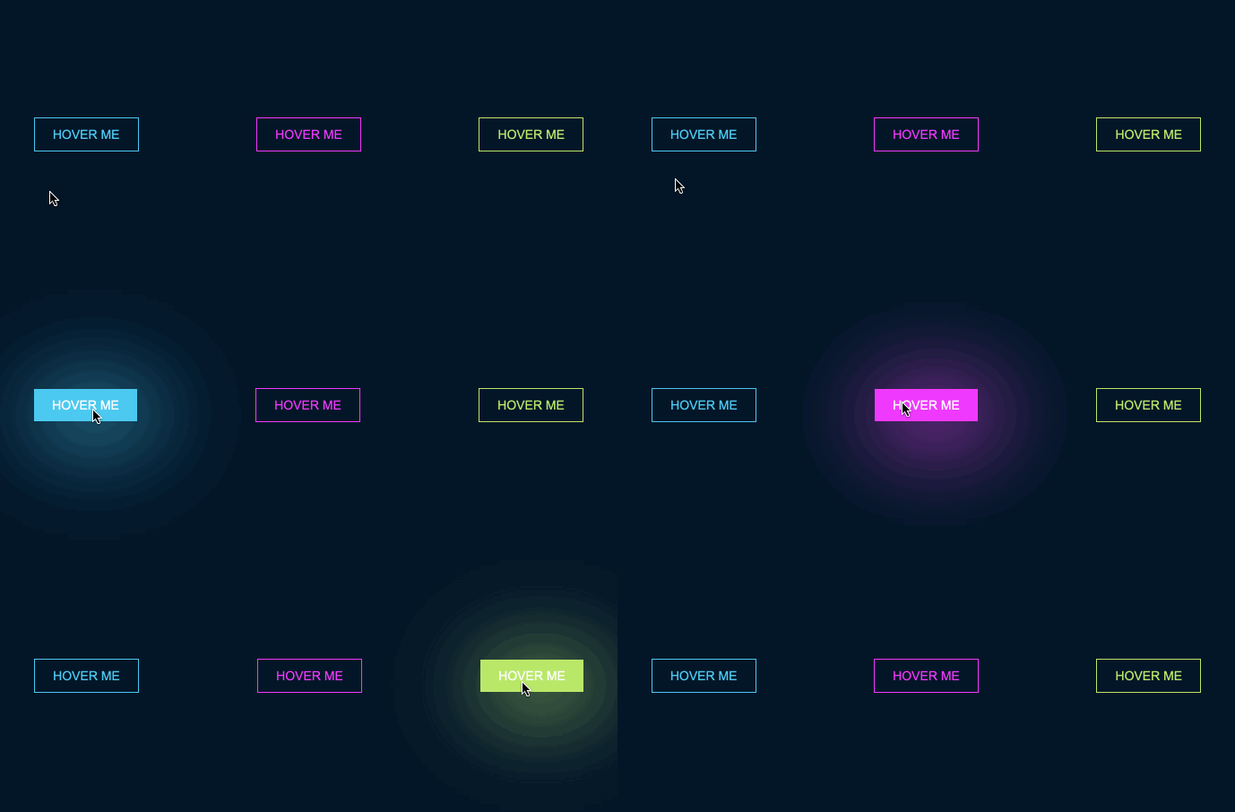
二.霓虹效果
HTML
<div id="neon-btn">
  <button class="btn one">Hover me</button>
  <button  class="btn two">Hover me</button>
  <button  class="btn three">Hover me</button>
</div>
CSS
#neon-btn {
  display: flex;
  align-items: center;
  justify-content: space-around;
  height: 100vh;
  background: #031628;
}

.btn {
  border: 1px solid;
  background-color: transparent;
  text-transform: uppercase;
  font-size: 14px;
  padding: 10px 20px;
  font-weight: 300;
}

.one {
  color: #4cc9f0;
}

.two {
  color: #f038ff;
}

.three {
  color: #b9e769;
}

.btn:hover {
  color: white;
  border: 0;
}

.one:hover {
  background-color: #4cc9f0;
  -webkit-box-shadow: 10px 10px 99px 6px rgba(76,201,240,1);
  -moz-box-shadow: 10px 10px 99px 6px rgba(76,201,240,1);
  box-shadow: 10px 10px 99px 6px rgba(76,201,240,1);
}

.two:hover {
  background-color: #f038ff;
  -webkit-box-shadow: 10px 10px 99px 6px rgba(240, 56, 255, 1);
  -moz-box-shadow: 10px 10px 99px 6px rgba(240, 56, 255, 1);
  box-shadow: 10px 10px 99px 6px rgba(240, 56, 255, 1);
}

.three:hover {
  background-color: #b9e769;
  -webkit-box-shadow: 10px 10px 99px 6px rgba(185, 231, 105, 1);
  -moz-box-shadow: 10px 10px 99px 6px rgba(185, 231, 105, 1);
  box-shadow: 10px 10px 99px 6px rgba(185, 231, 105, 1);
}
GIF图
 ](https://raw.githubusercontent.com/reng99/blogs/master/capture/hover-effect/hover_effect_neon.gif)
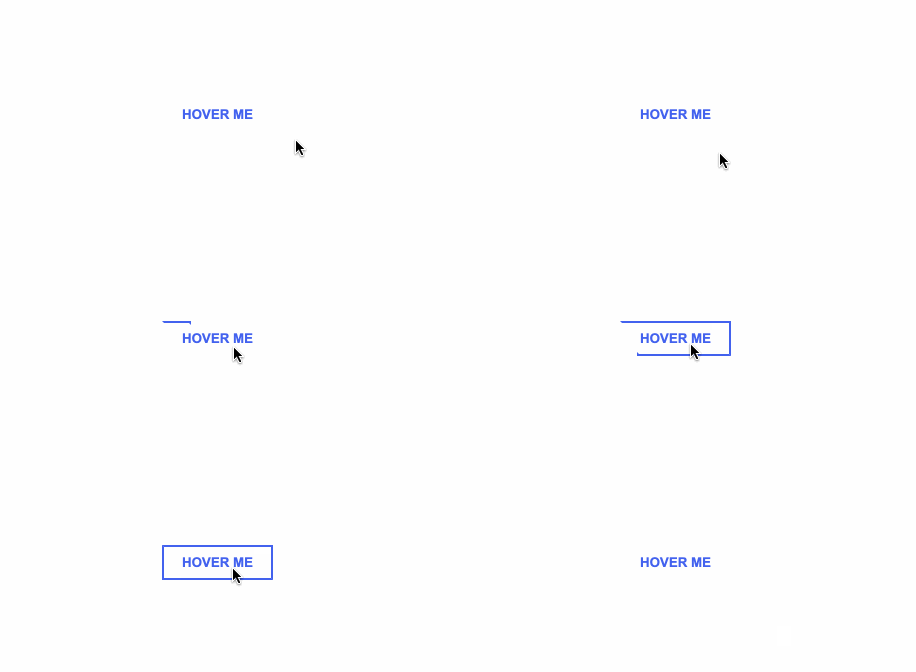
三.边框效果
HTML
<div id="draw-border">
  <button>Hover me</button>
</div>
CSS
#draw-border {
  display: flex;
  align-items: center;
  justify-content: center;
  height: 100vh;
}

button {
  border: 0;
  background: none;
  text-transform: uppercase;
  color: #4361ee;
  font-weight: bold;
  position: relative;
  outline: none;
  padding: 10px 20px;
  box-sizing: border-box;
}

button::before, button::after {
  box-sizing: inherit;
  position: absolute;
  content: '';
  border: 2px solid transparent;
  width: 0;
  height: 0;
}

button::after {
  bottom: 0;
  right: 0;
}

button::before {
  top: 0;
  left: 0;
}

button:hover::before, button:hover::after {
  width: 100%;
  height: 100%;
}

button:hover::before {
  border-top-color: #4361ee;
  border-right-color: #4361ee;
  transition: width 0.3s ease-out, height 0.3s ease-out 0.3s;
}

button:hover::after {
  border-bottom-color: #4361ee;
  border-left-color: #4361ee;
  transition: border-color 0s ease-out 0.6s, width 0.3s ease-out 0.6s, height 0.3s ease-out 1s;
}
GIF效果
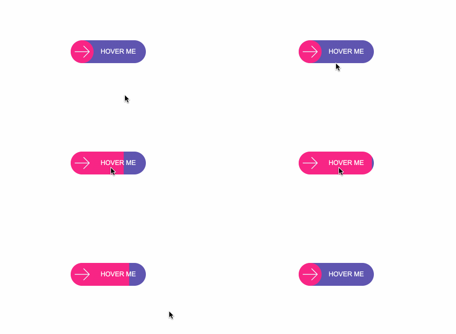
四.圆形效果
HTML
<div id="circle-btn">
  <div class="btn-container">
    // 这里有一个svg元素
    <button>Hover me</button>
  </div>
</div>
CSS
#circle-btn {
  display: flex;
  align-items: center;
  justify-content: center;
  height: 100vh;
}

.btn-container {
  position: relative;
}

button {
  border: 0;
  border-radius: 50px;
  color: white;
  background: #5f55af;
  padding: 15px 20px 16px 60px;
  text-transform: uppercase;
  background: linear-gradient(to right, #f72585 50%, #5f55af 50%);
  background-size: 200% 100%;
  background-position: right bottom;
  transition:all 2s ease;
}

svg {
  background: #f72585;
  padding: 8px;
  border-radius: 50%;
  position: absolute;
  left: 0;
  top: 0%;
}

button:hover {
   background-position: left bottom;
}
GIF图
五.圆角效果
HTML
<div id="border-btn">
  <button>Hover me</button>
</div>
CSS
#border-btn {
  display: flex;
  align-items: center;
  justify-content: center;
  height: 100vh;
}

button {
  border: 0;
  border-radius: 10px;
  background: #2ec4b6;
  text-transform: uppercase;
  color: white;
  font-size: 16px;
  font-weight: bold;
  padding: 15px 30px;
  outline: none;
  position: relative;
  transition: border-radius 3s;
  -webkit-transition: border-radius 3s;
}

button:hover {
   border-bottom-right-radius: 50px;
   border-top-left-radius: 50px;
   border-bottom-left-radius: 10px;
   border-top-right-radius: 10px;
}
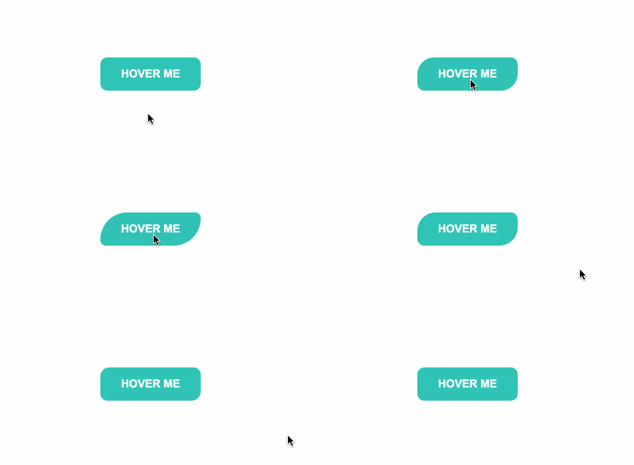
GIF图
六.冰冻效果
HTML
<div id="frozen-btn">
  <button class="green">Hover me</button>
  <button class="purple">Hover me</button>
</div>
CSS
#frozen-btn {
  display: flex;
  align-items: center;
  justify-content: center;
  height: 100vh;
}

button {
  border: 0;
  margin: 20px;
  text-transform: uppercase;
  font-size: 20px;
  font-weight: bold;
  padding: 15px 50px;
  border-radius: 50px;
  color: white;
  outline: none;
  position: relative;
}

button:before{
  content: '';
  display: block;
  background: linear-gradient(to left, rgba(255, 255, 255, 0) 50%, rgba(255, 255, 255, 0.4) 50%);
  background-size: 210% 100%;
  background-position: right bottom;
  height: 100%;
  width: 100%;
  position: absolute;
  top: 0;
  bottom:0;
  right:0;
  left: 0;
  border-radius: 50px;
  transition: all 1s;
  -webkit-transition: all 1s;
}

.green {
   background-image: linear-gradient(to right, #25aae1, #40e495);
   box-shadow: 0 4px 15px 0 rgba(49, 196, 190, 0.75);
}

.purple {
   background-image: linear-gradient(to right, #6253e1, #852D91);
   box-shadow: 0 4px 15px 0 rgba(236, 116, 149, 0.75);
}

.purple:hover:before {
  background-position: left bottom;
}

.green:hover:before {
  background-position: left bottom;
}
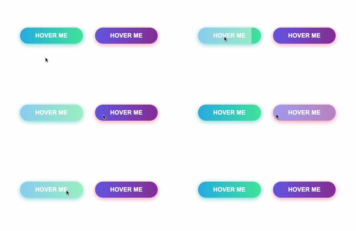
GIF图
七.闪亮效果
HTML
<div id="shiny-shadow">
  <button><span>Hover me</span></button>
</div>
CSS
#shiny-shadow {
  display: flex;
  align-items: center;
  justify-content: center;
  height: 100vh;
  background: #1c2541;
}

button {
  border: 2px solid white;
  background: transparent;
  text-transform: uppercase;
  color: white;
  padding: 15px 50px;
  outline: none;
  overflow: hidden;
  position: relative;
}

span {
  z-index: 20;
}

button:after {
  content: '';
    display: block;
    position: absolute;
    top: -36px;
    left: -100px;
    background: white;
    width: 50px;
    height: 125px;
    opacity: 20%;
    transform: rotate(-45deg);
}

button:hover:after {
  left: 120%;
  transition: all 600ms cubic-bezier(0.3, 1, 0.2, 1);
   -webkit-transition: all 600ms cubic-bezier(0.3, 1, 0.2, 1);
}
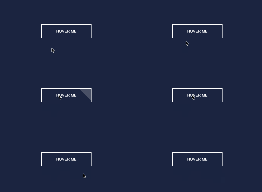
GIF图
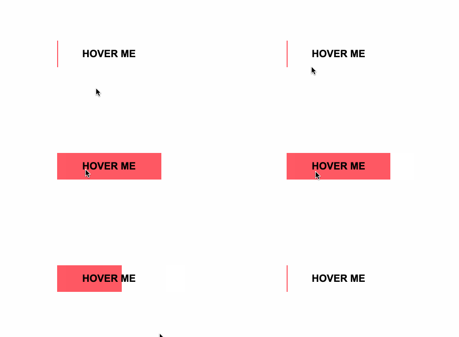
八.加载效果
HTML
<div id="loading-btn">
  <button><span>Hover me</span></button>
</div>
CSS
#loading-btn {
  display: flex;
  align-items: center;
  justify-content: center;
  height: 100vh;
}

button {
  background: transparent;
  border: 0;
  border-radius: 0;
  text-transform: uppercase;
  font-weight: bold;
  font-size: 20px;
  padding: 15px 50px;
  position: relative;
}

button:before {
  transition: all 0.8s cubic-bezier(0.7, -0.5, 0.2, 2);
  content: '';
  width: 1%;
  height: 100%;
  background: #ff5964;
  position: absolute;
  top: 0;
  left: 0;
}

button span {
  mix-blend-mode: darken;
}

button:hover:before {
  background: #ff5964;
  width: 100%;
}
GIF图
总结
巧用伪元素:before、:after等,让你的页面按钮眼前一亮。原文链接:8 amazing HTML button hover effects, that will make your website memorable。